
Clements Wharf | A Riverside Home Reimagined
A riverside maisonette in the heart of Durham redesigned to bring stronger flow, safer transitions and a more luxurious sense of living to a former student apartment.
Clements Wharf was a full refurbishment of a riverside maisonette, originally used as student accommodation and in need of a complete rethink before it could feel like home. The layout itself was not being structurally changed, but the way the apartment functioned, flowed and was experienced needed to shift dramatically. The brief was to create a home that felt refined, luxurious and grown up, with the atmosphere of a high-end hotel but the practicality needed for everyday life. The client was drawn to modern luxury, darker neutrals, texture, rhythm and a stronger sense of wow, while still wanting the apartment to feel comfortable, welcoming and easy to live in.
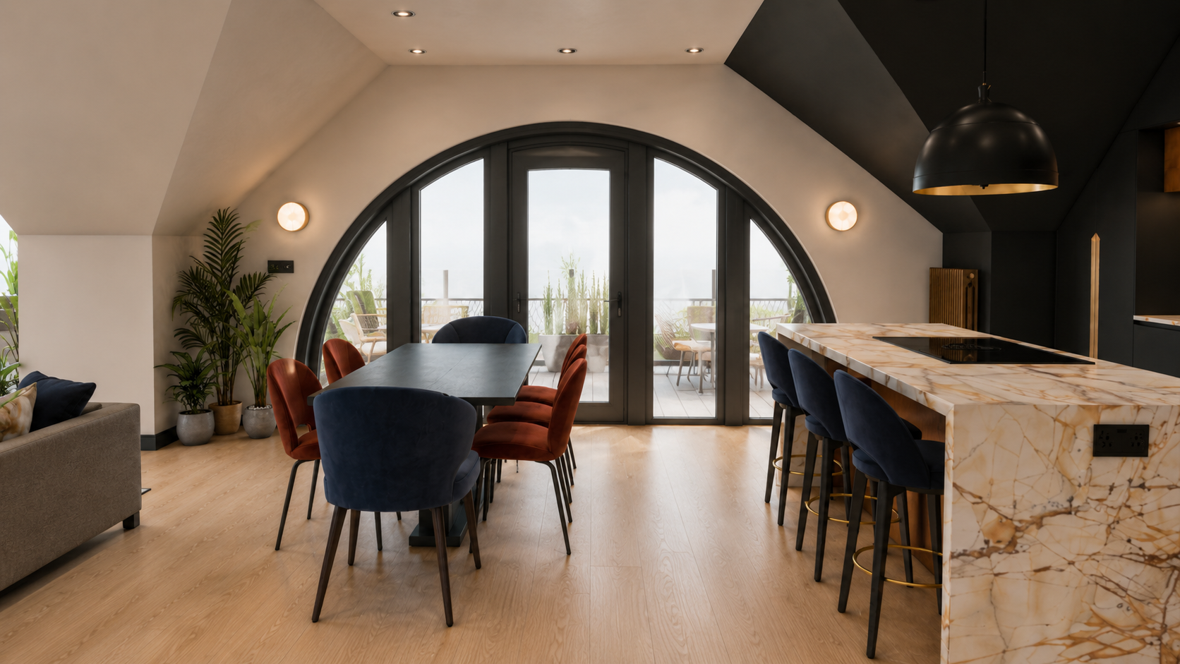
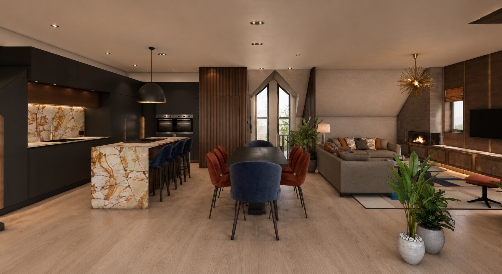
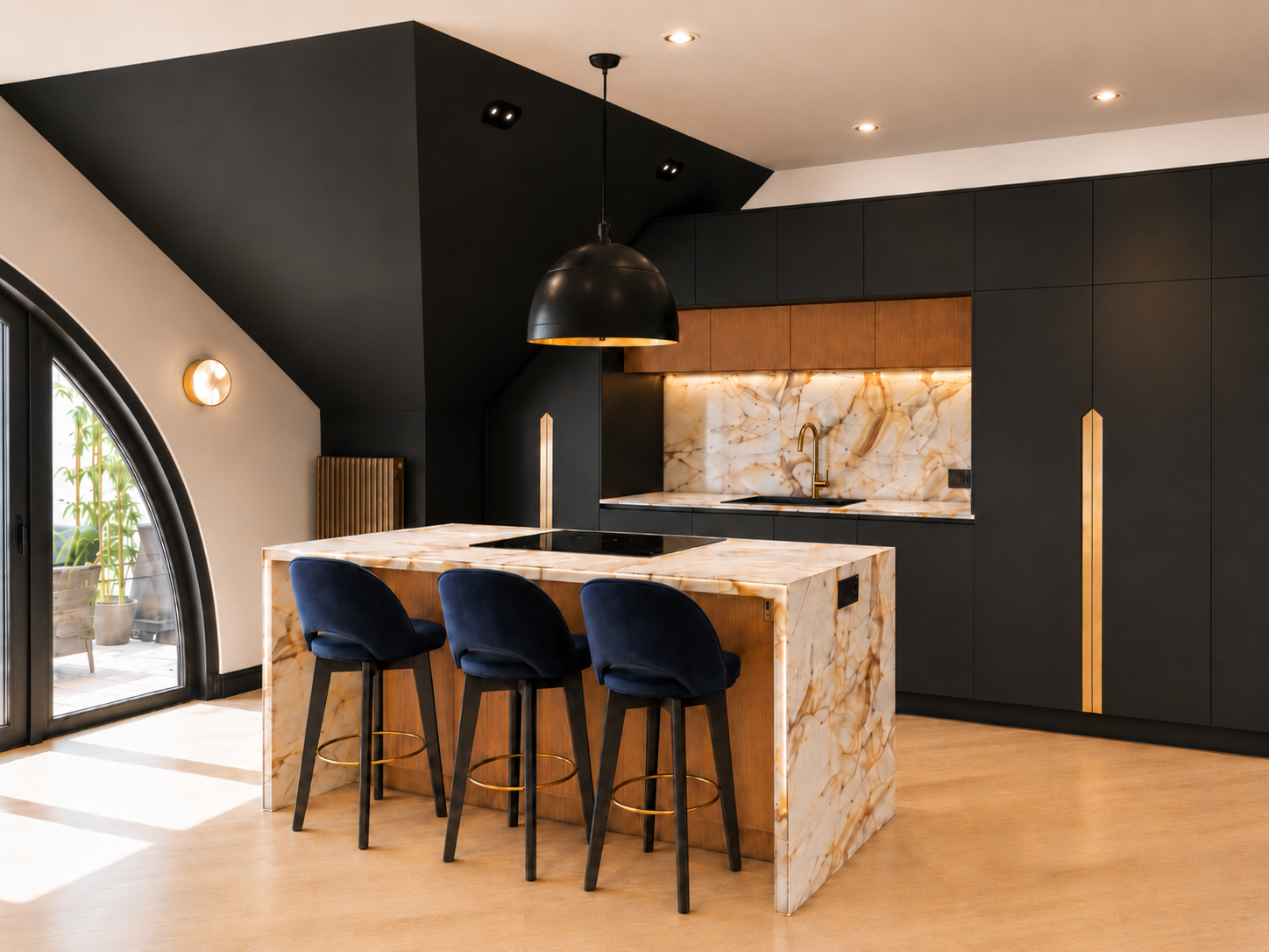
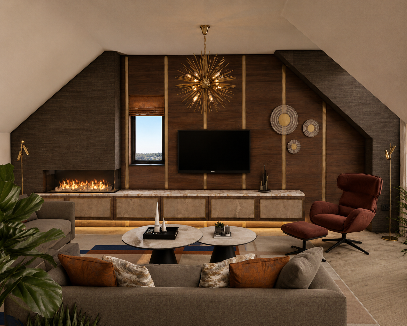
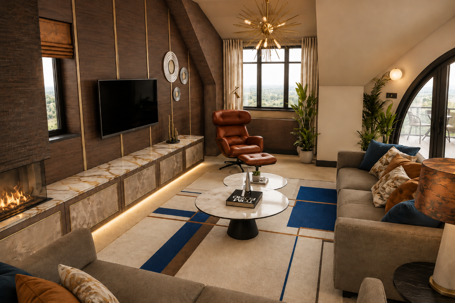
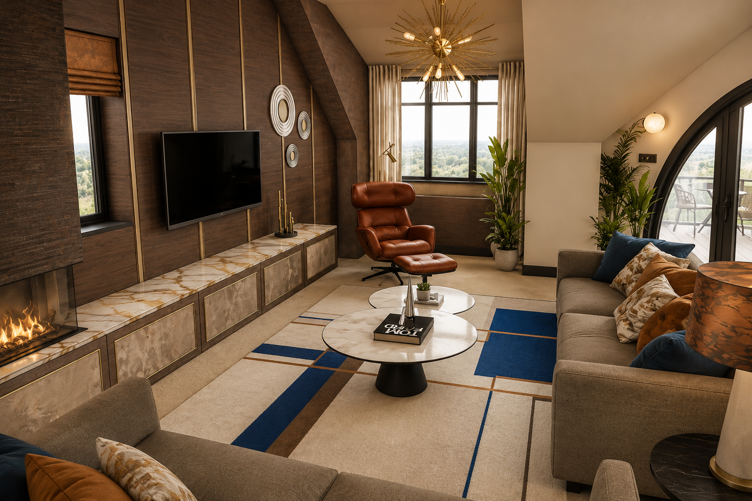
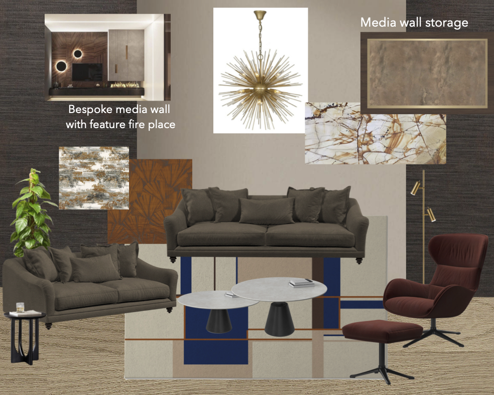
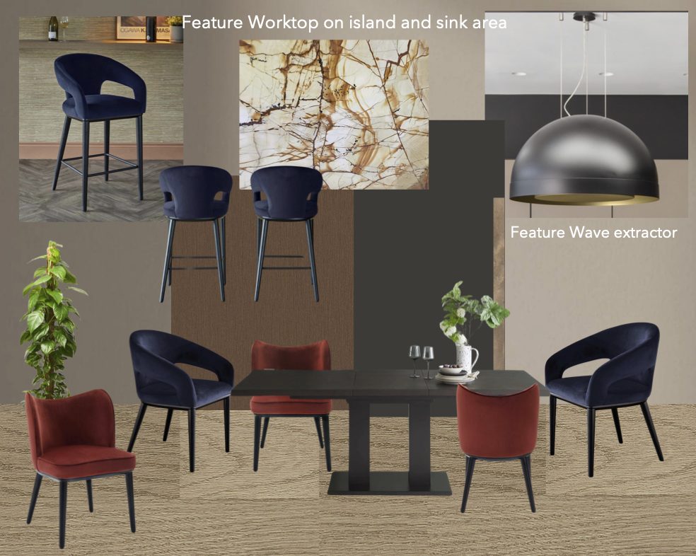
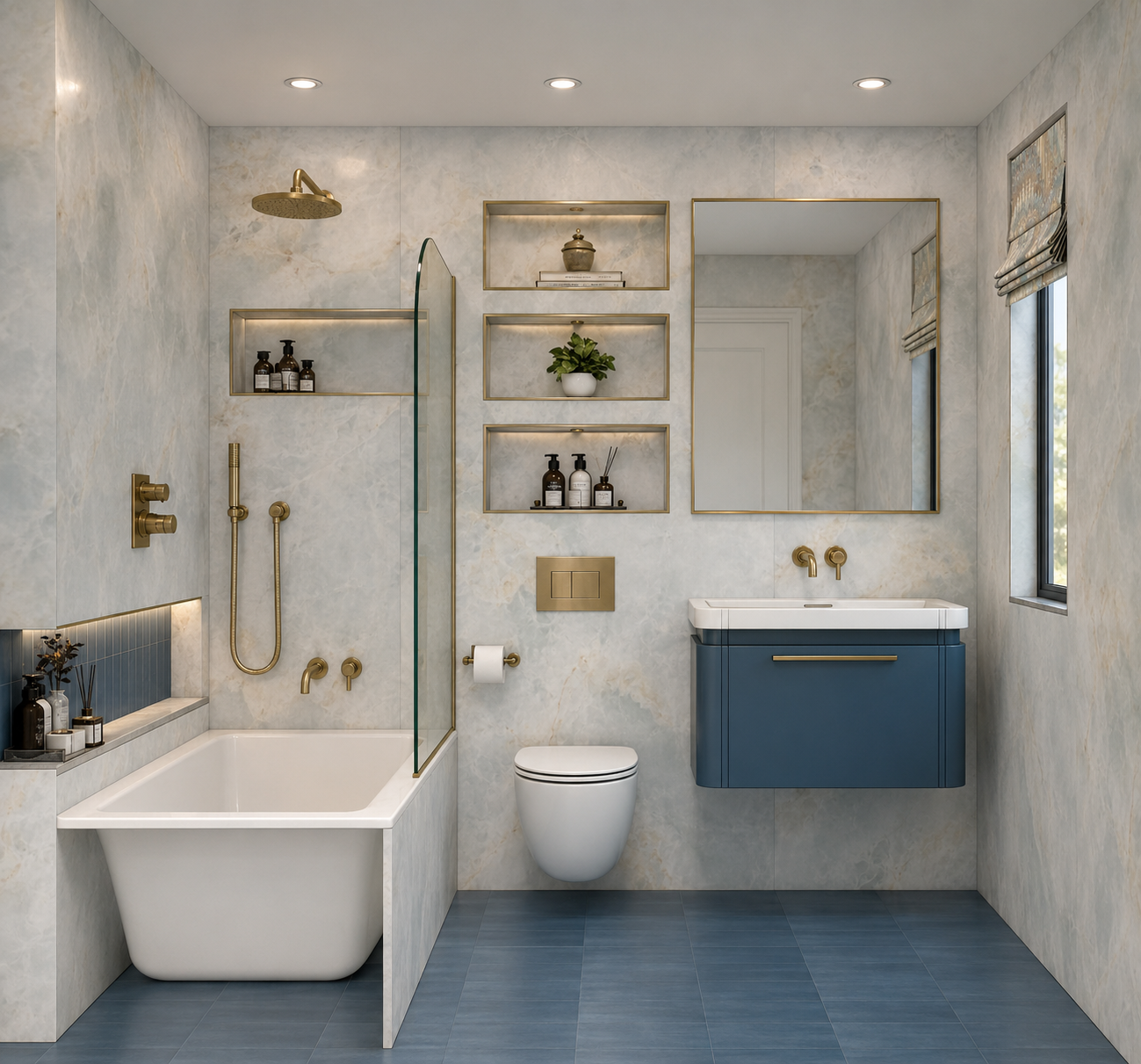
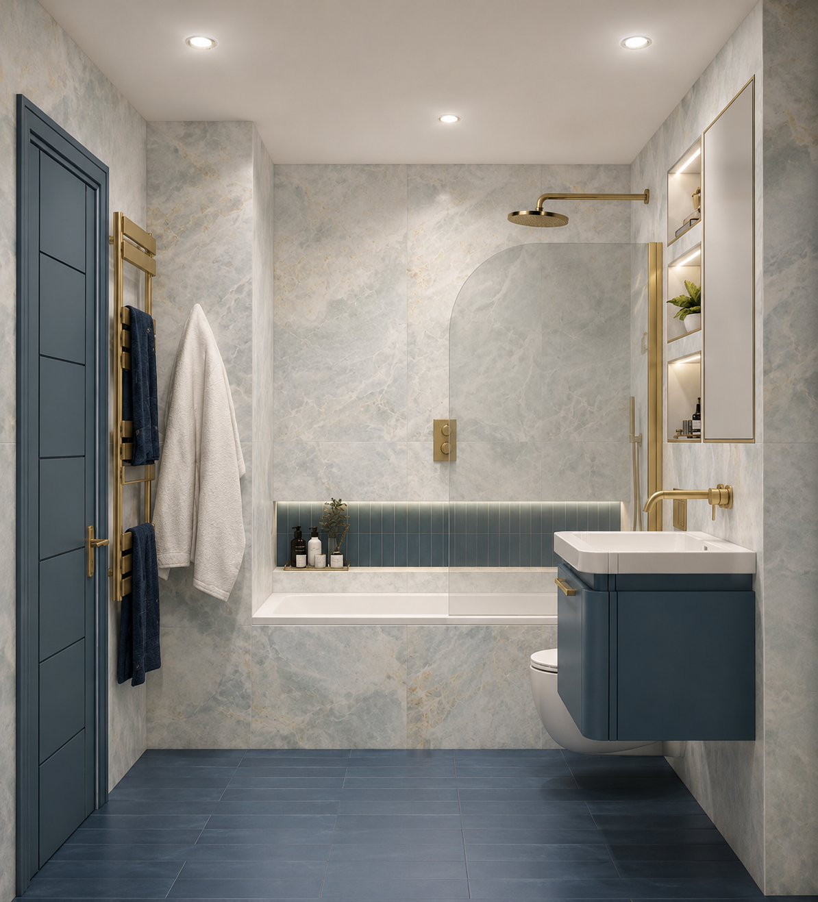
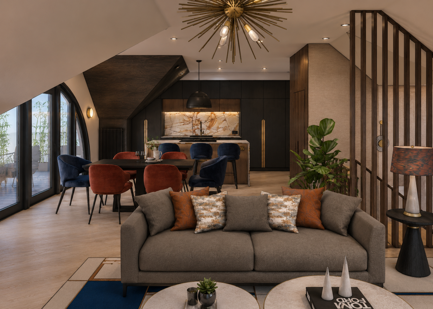
The most significant transformation happened on the top floor, where the existing open-plan living space felt underused and unresolved despite its scale and riverside views. The kitchen was relocated from one corner of the room to create a far more functional and luxurious arrangement, with a feature island that immediately strengthened the sense of arrival at the top of the stairs. This move also allowed the rest of the space to be zoned more intelligently, creating a clearer relationship between kitchen, dining and living without losing the openness of the room. The vaulted ceiling, rather than being treated as a difficulty, was used to help define each area and give the room a stronger rhythm and sense of order. The living space was then anchored at the opposite end with a fireplace and media wall, turning what had been a loose, unfocused room into one with far more presence, comfort and purpose.
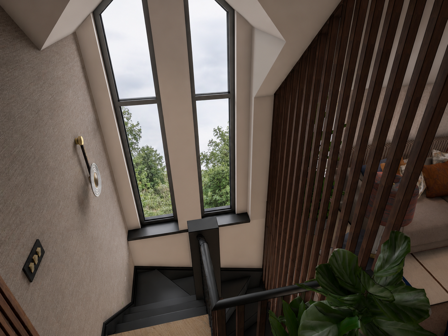
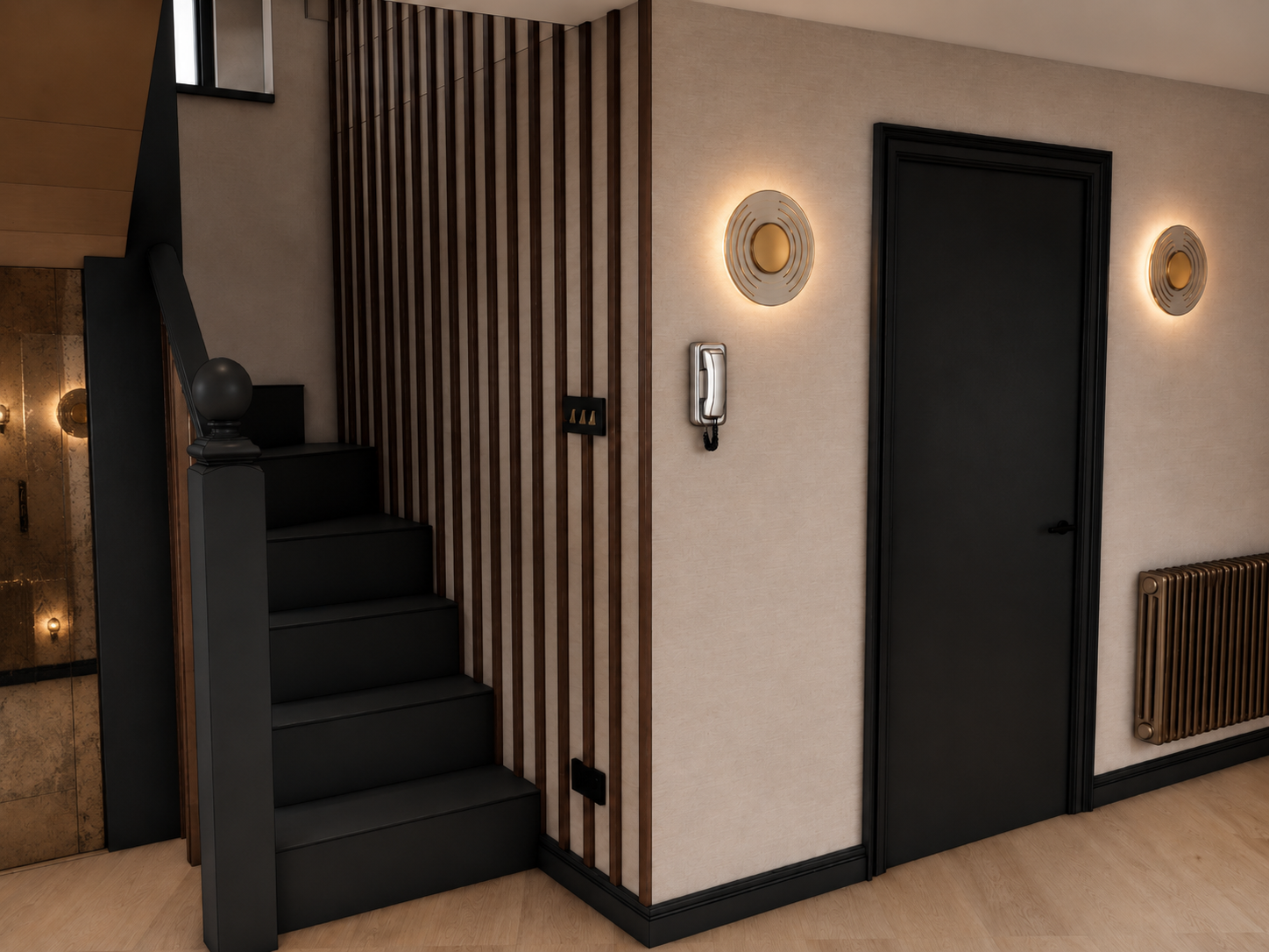
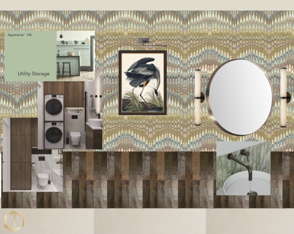
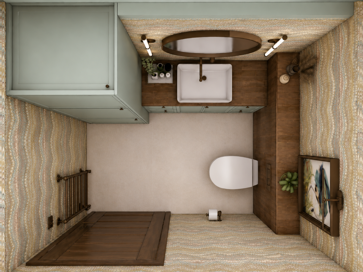
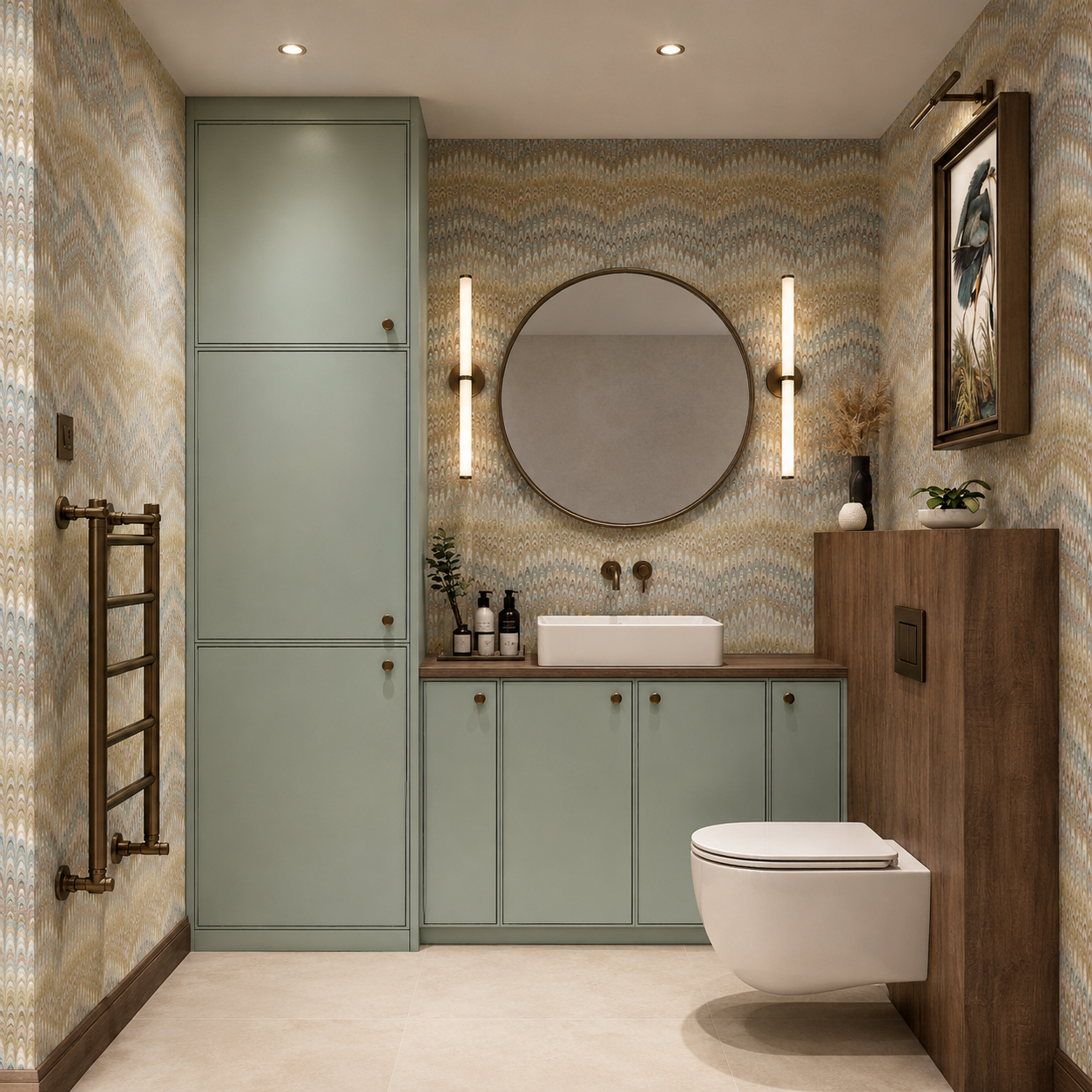
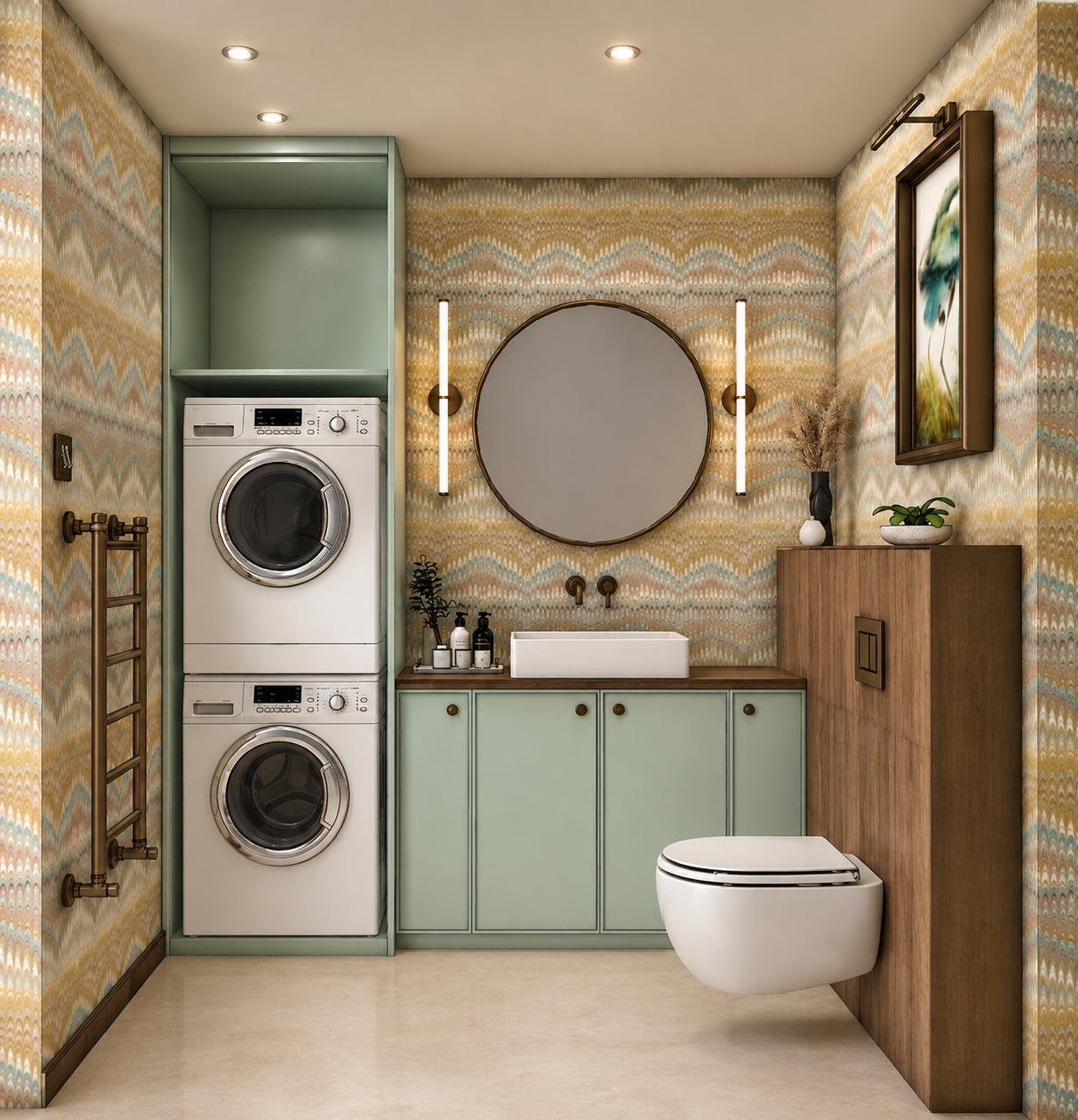
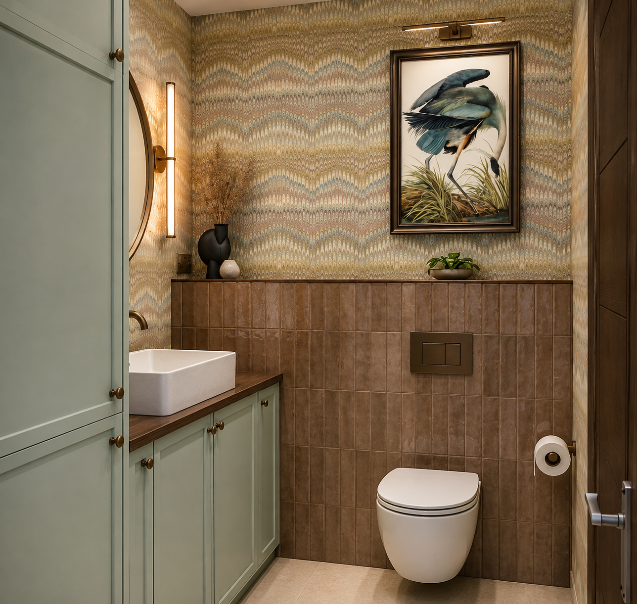
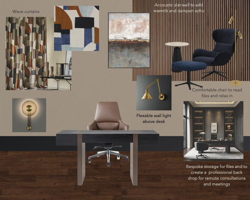
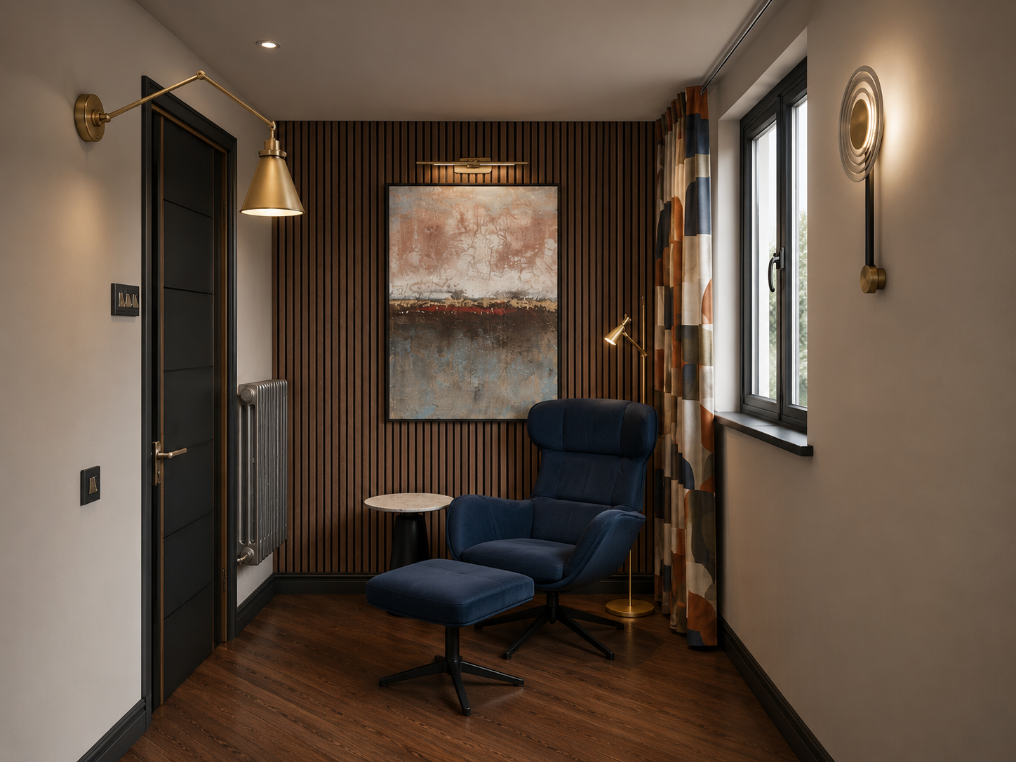
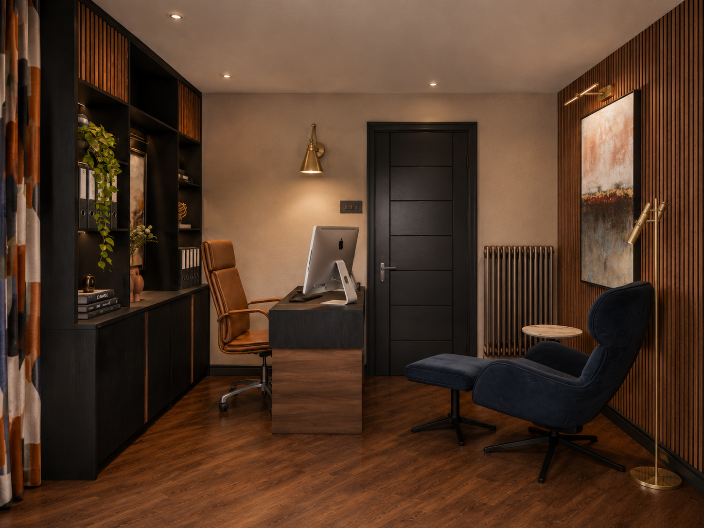
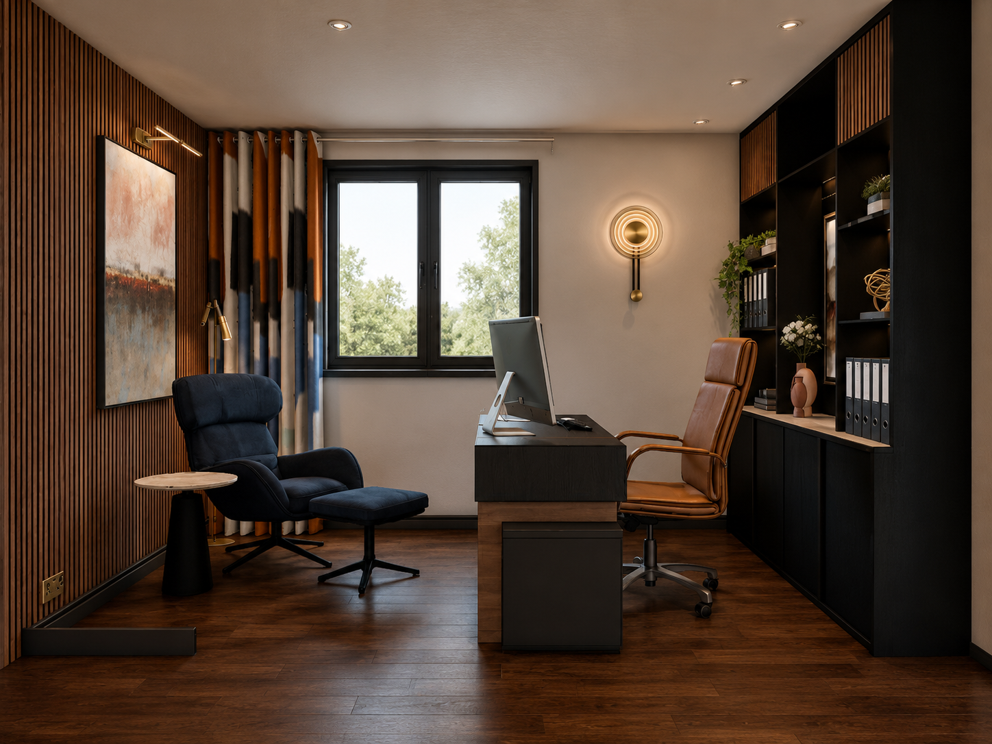
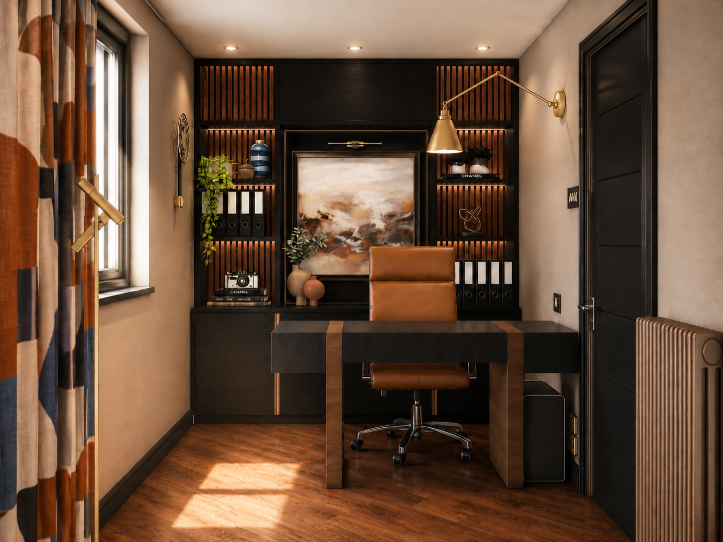
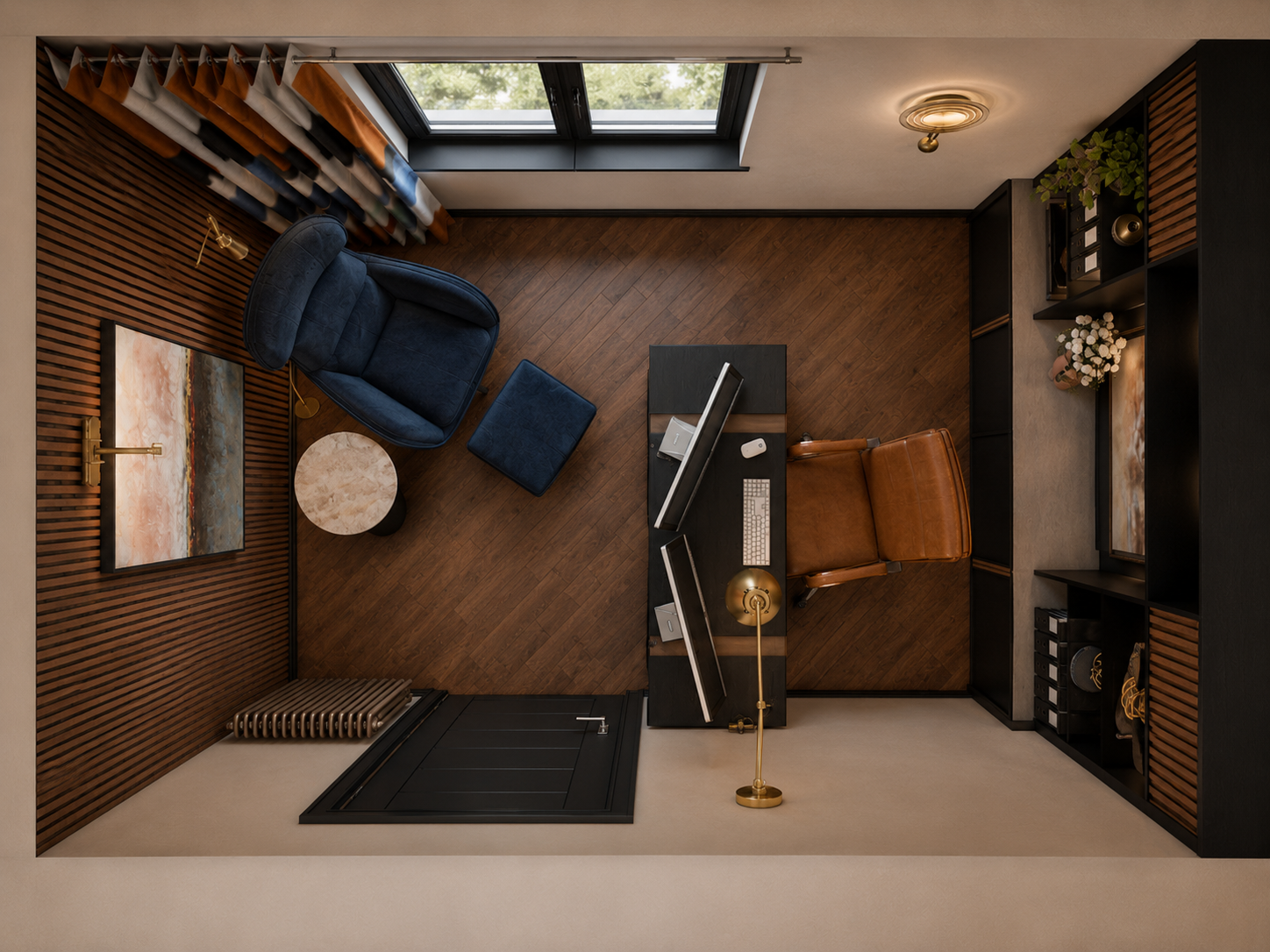
That same thinking carried through the rest of the apartment. The original balustrade at the stair was replaced with a slatted design that made the transition safer while also linking the lower and upper floors more elegantly. At the top of the stairs, cloakroom storage was designed to create a proper landing space, somewhere to arrive, put things down, sit to remove shoes and keep clutter from spilling into the main living area. Downstairs, one bedroom was reimagined as a home office with bespoke storage and a stronger visual backdrop for conference calls, while the bathroom on that level became a combined guest cloakroom and utility so practical tasks could be contained away from the open-plan space above. Even the darker, windowless areas were treated carefully, with textured wall finishes, metallic surfaces and layered lighting used to bounce light around and create more atmosphere.
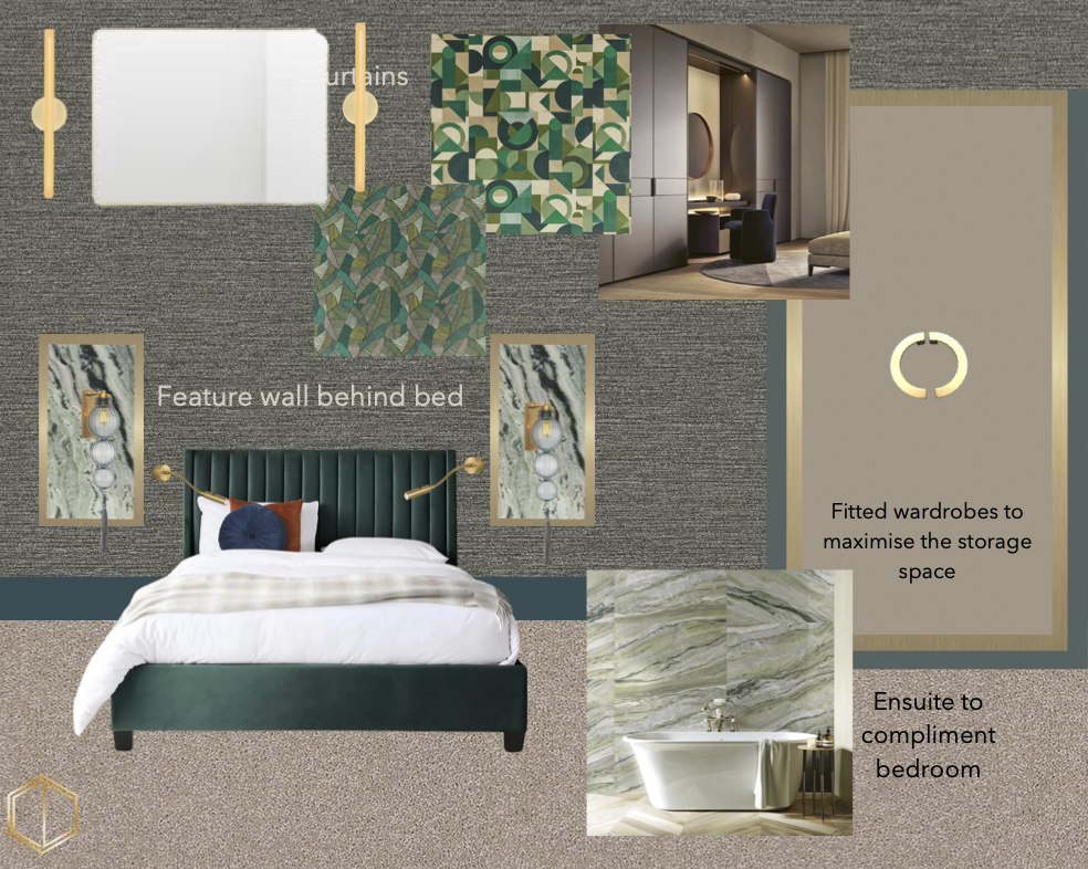
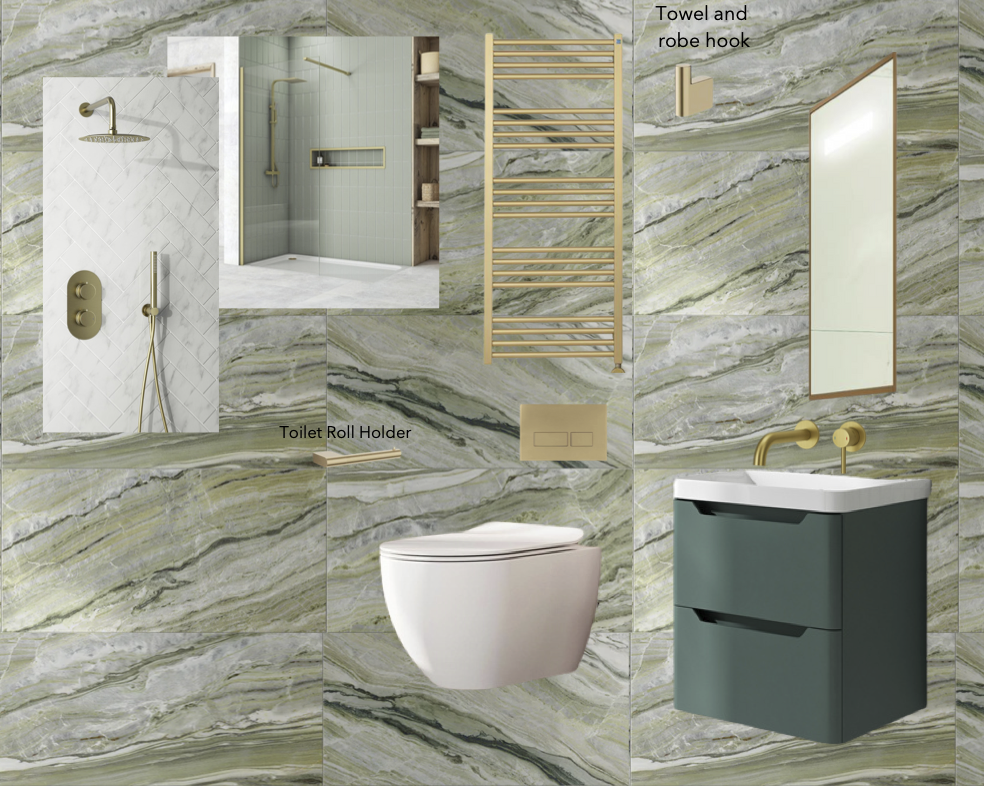
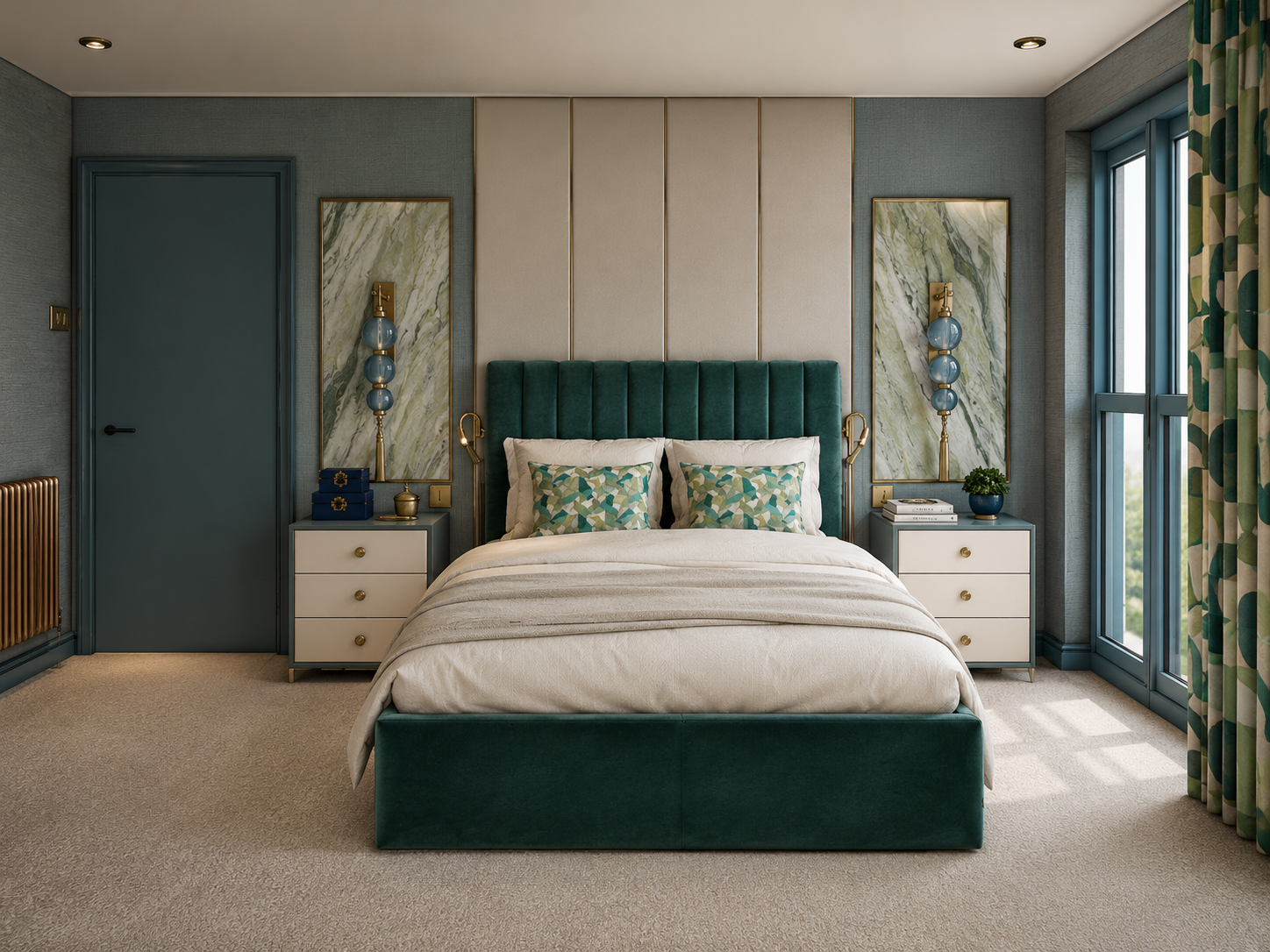
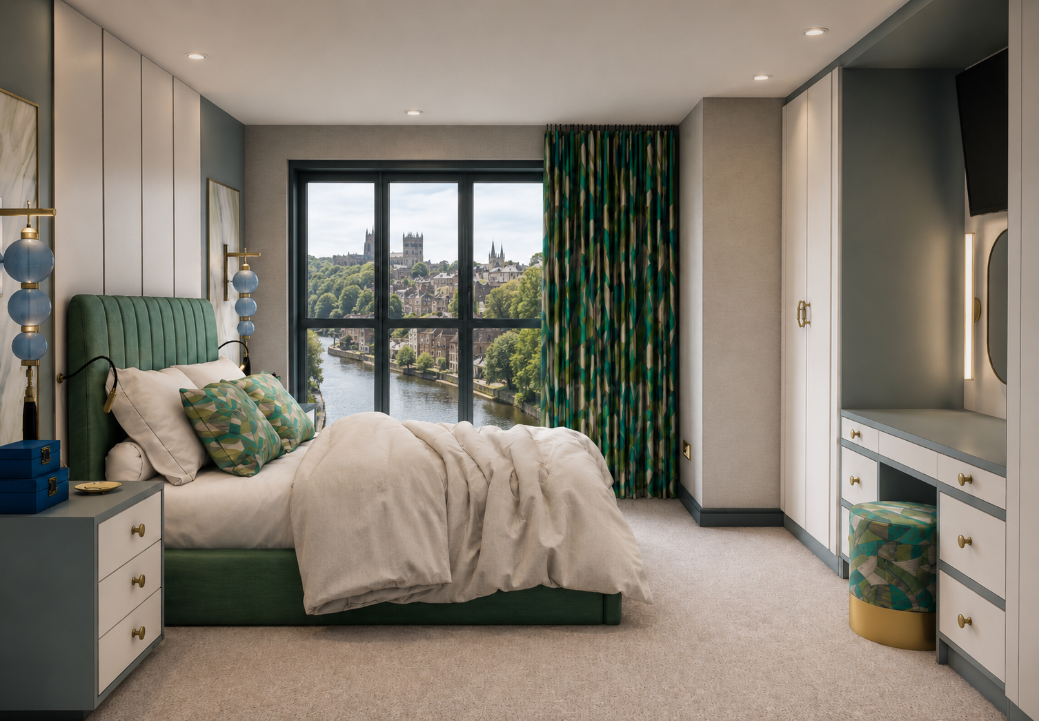
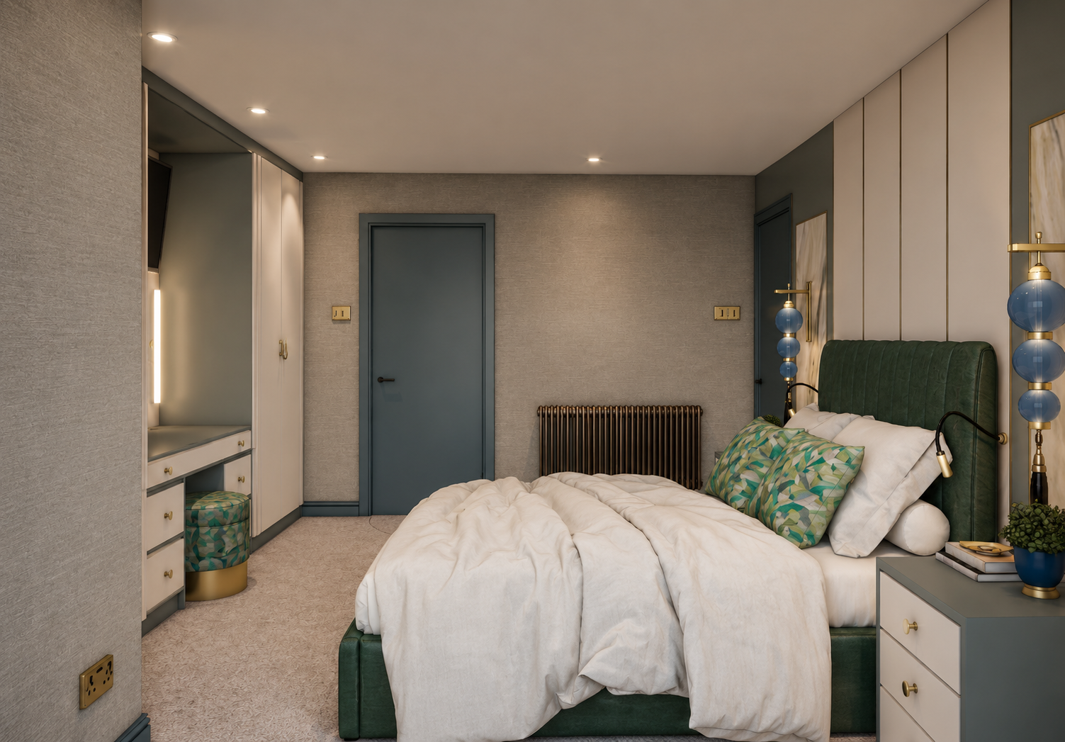
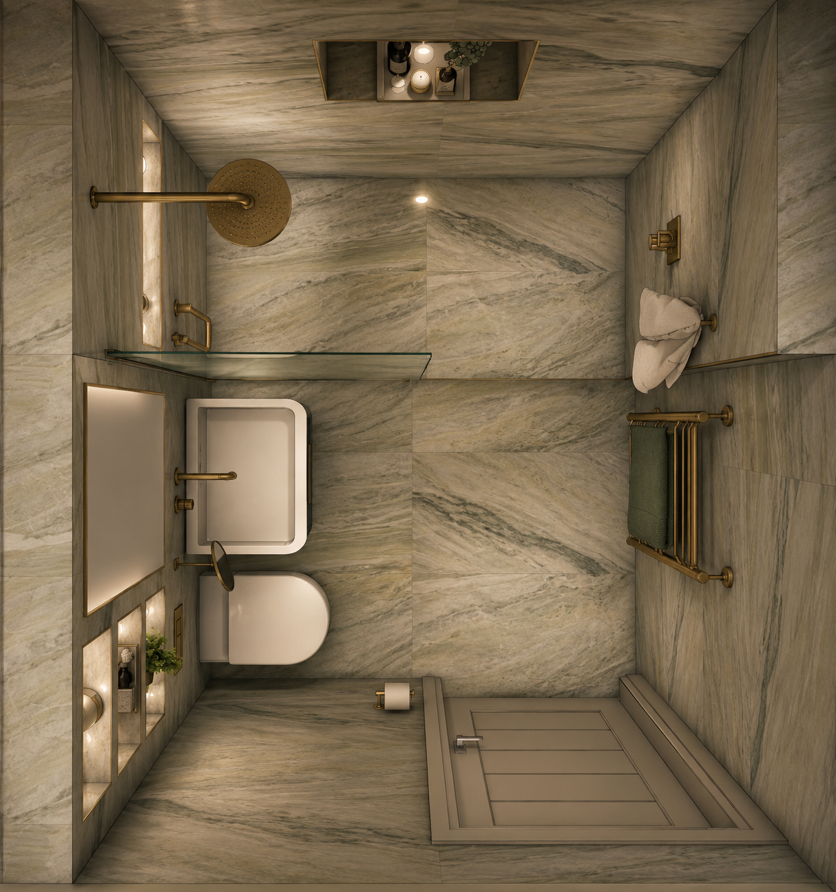
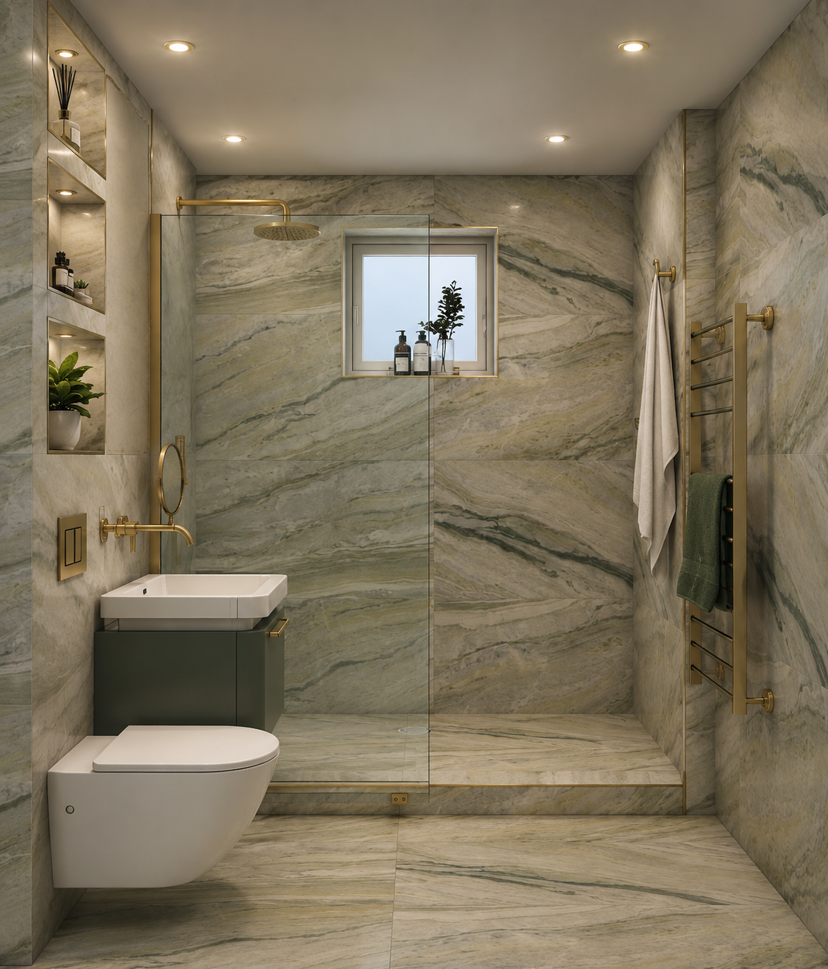
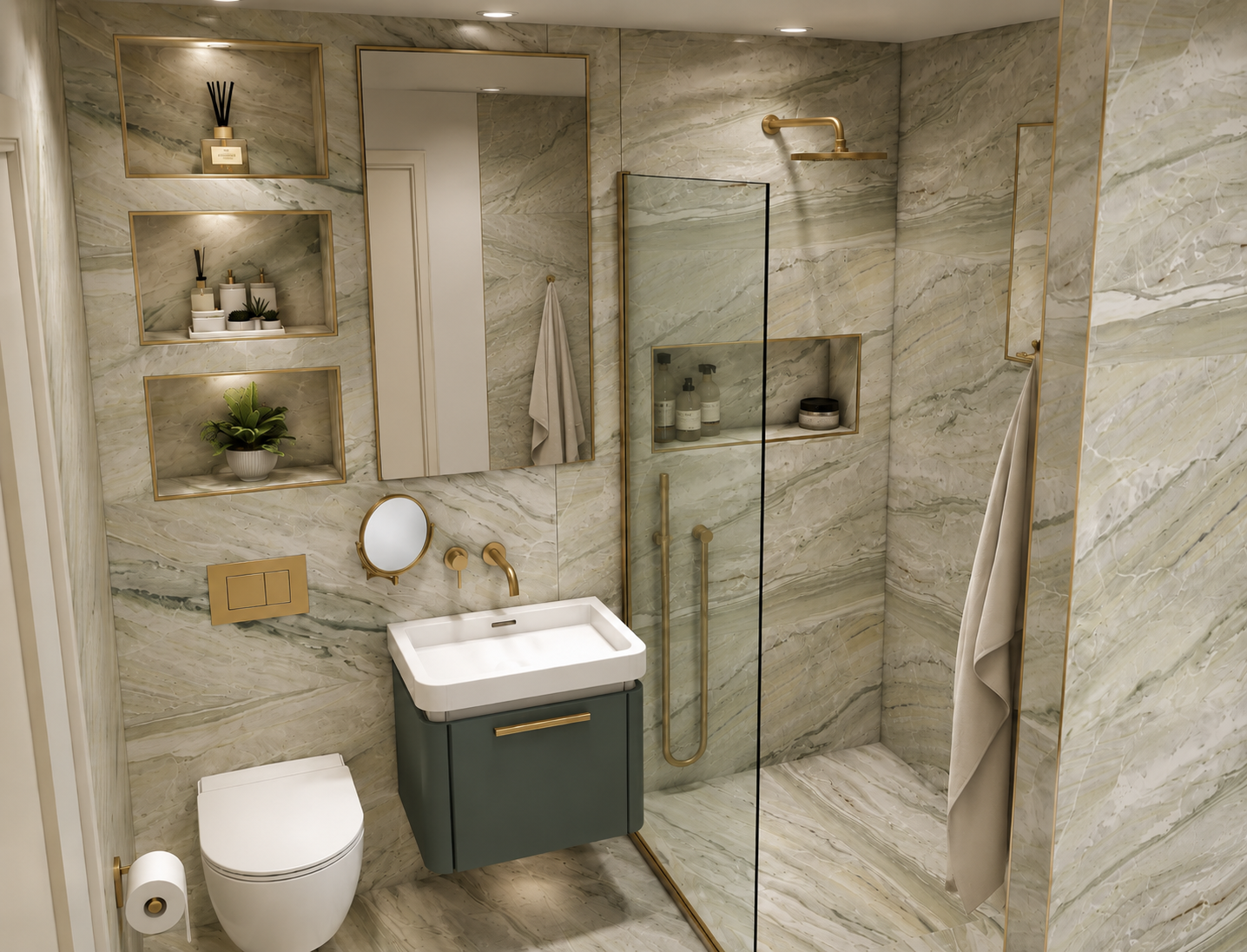
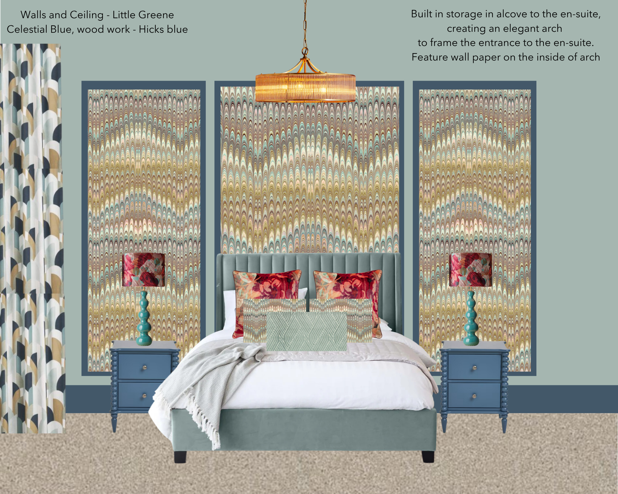
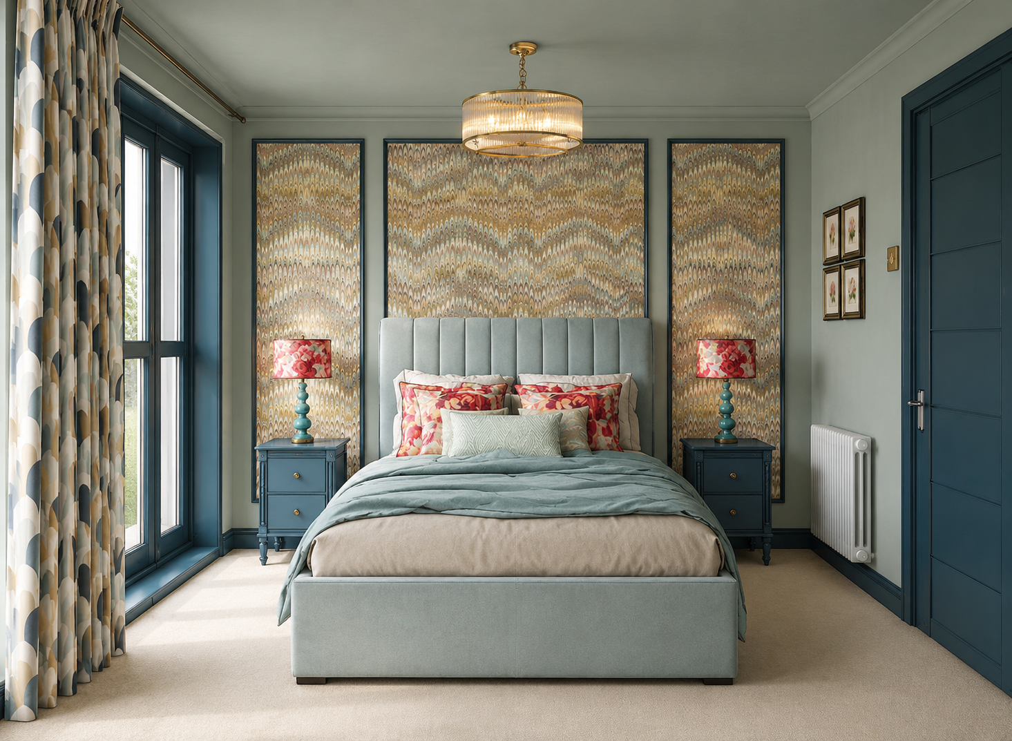
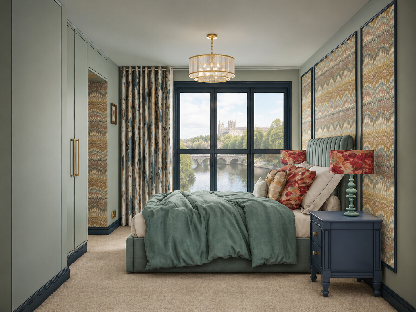
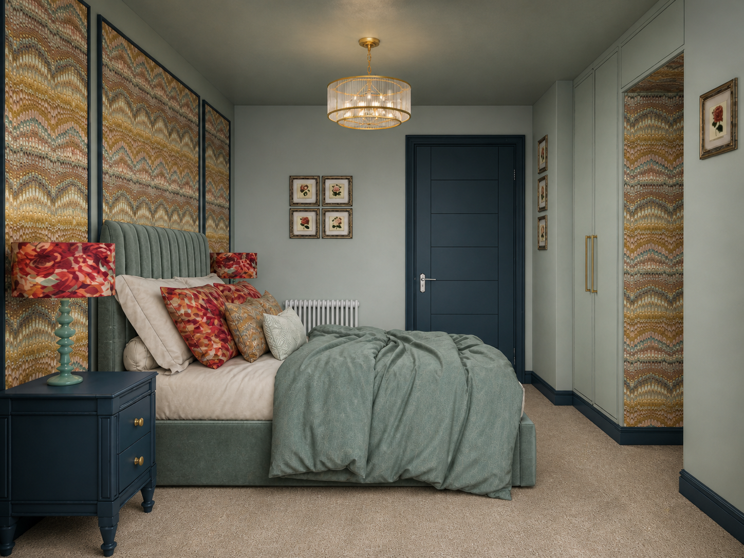
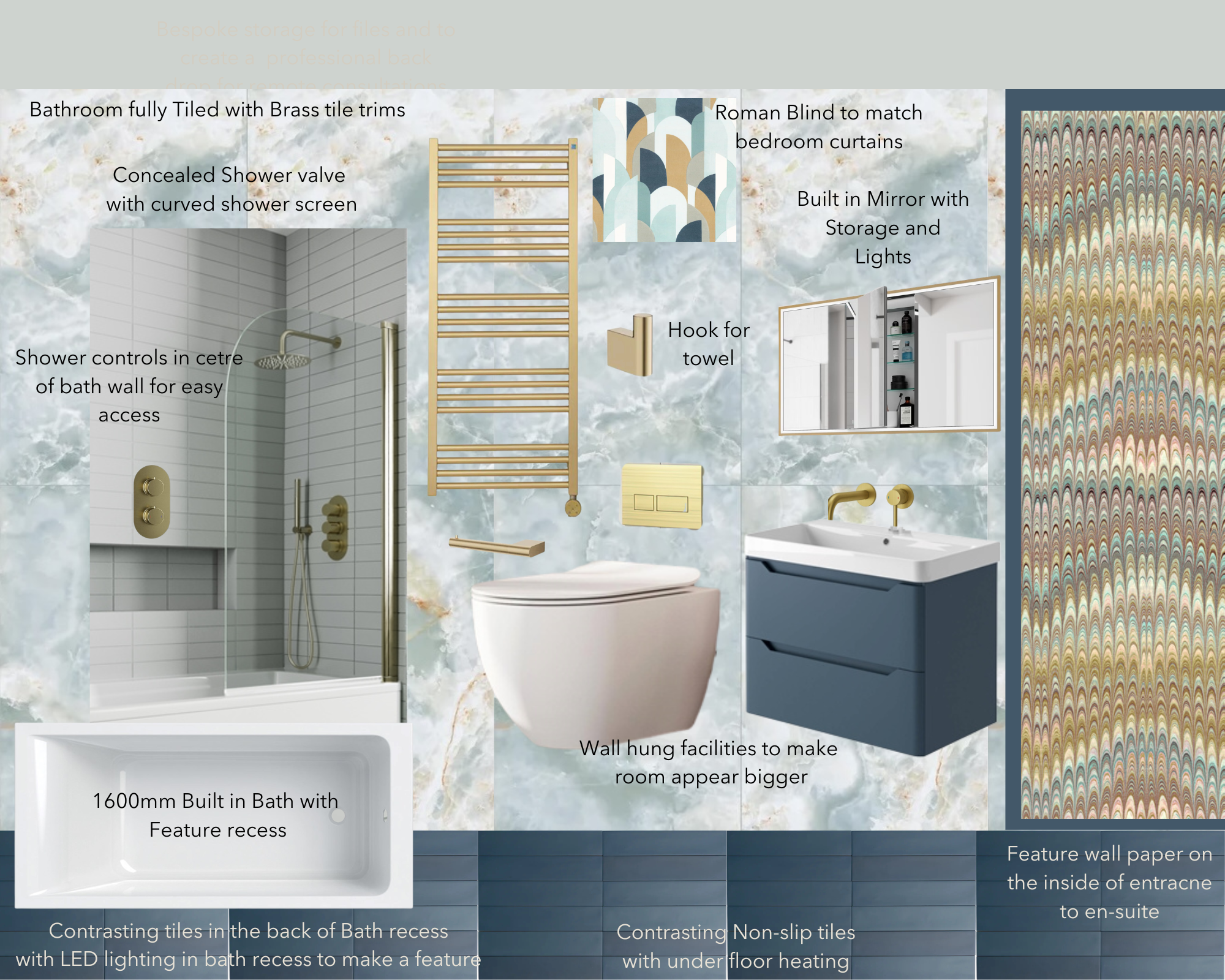
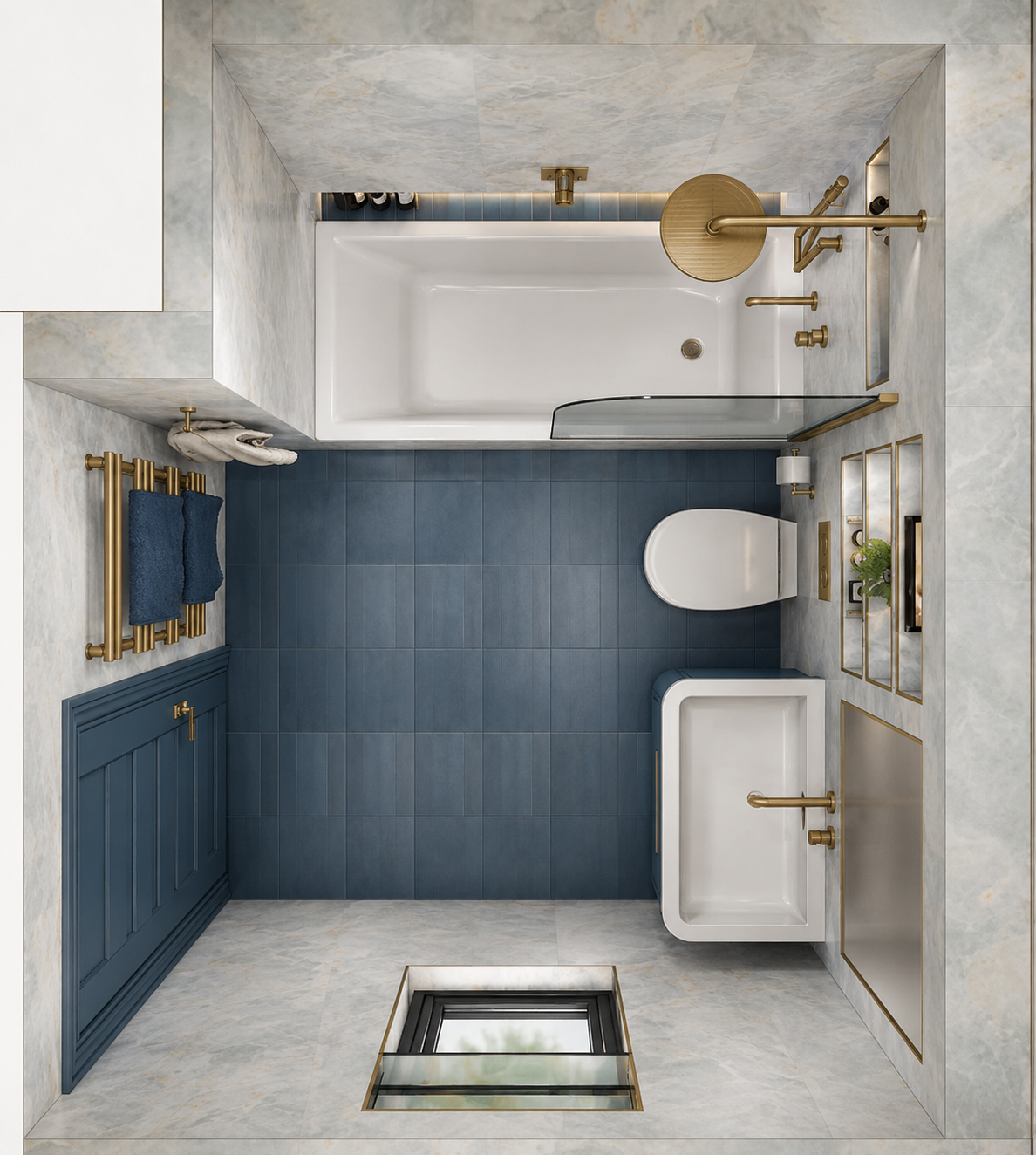
The private rooms were designed with the same balance of comfort and refinement. The principal bedroom and ensuite used texture, softer tones and a calmer palette to promote rest and restore a sense of luxury, while the guest bedroom introduced a gentler, more feminine note and made more efficient use of the footprint through integrated storage linking the bedroom and ensuite. Across the whole apartment, the scheme focused on rhythm, material contrast and a more cosmopolitan sense of living, turning a once-generic student property into a much more resolved riverside home. The result was a design that balanced wow factor with function, and glamour with everyday ease, showing how much can change when a fixed shell is rethought with greater clarity and purpose.
This page shows design visuals from the approved scheme.
Inspired by this project? Book a Connection Call and let’s talk about your home.